
Refresh Packaging Design Without Losing Brand Equity
What Is Brand Equity?
Brand equity refers to the perceived worth of your brand—or the social value of your brand name—and this value can be determined in various ways, such as the perceived quality of your products, the awareness of your brand, loyalty to your brand (customer retention), and positive brand associations, among many. New to world brands generally lack brand equity. It’s an attribute built over time with a brand marketing strategy and serves to position a brand within its product category and, most importantly, within the consumer’s mind.
The strongest brands retain anywhere from 65% – 90% of their customers year over year. They do this by staying agile and evolving their brand strategy, brand identity, and associated brand assets to remain relevant to changing times and shifting consumer tastes. In the fast-moving consumer packaged goods world, the strongest identifier of brand identity is packaging design. To state the obvious, branded packaging is an essential medium for building brand equity. From brand logo styling to color palette, to projecting an overall ‘look and feel,’ few other elements in the marketing mix are as crucial as carefully considered, well designed, and pleasing packaging design. Inspired packaging captures and captivates new customers, builds familiarity, expands awareness, and cultivates preference.
Radical Redesign, Or a Simple Update to Your Packaging Design?
Even the most thoughtfully‐designed packaging can end up looking stale over time. Just as style and fashion change, your product’s packaging design should follow suit. A brand’s package look and feel that appealed to retailers and customers in the early aughts may no longer convey your brand’s meaning to current consumers. If you haven’t re-evaluated your packaging design’s relevance and resonance with your target market in five or more years, chances are you’re missing out on an opportunity to leverage untapped brand equity that can lead to more sales and greater market share.
A packaging redesign, whether it be a gentle refresh or a major facelift, isn’t just a design overhaul—it’s most successful when accompanied by the development of a carefully considered, finely tuned brand strategy. A strategic foundation will take into account key consumer identifiers of brand equity while uncovering adjustments required to the core components of your brand identity. The goal is to retain your hard-won brand recognition, protecting its heart and soul, while burnishing and polishing all of its attributes for increased effectiveness. Read on for insights on the strategic and creative process Affinity deployed to redesign, reposition, and relaunch the Anchorage Distillery line of craft spirits. The agency corrected an unclear brand proposition, improved dated packaging, and flipped low-value communication while retaining and showcasing their most valuable brand equity.
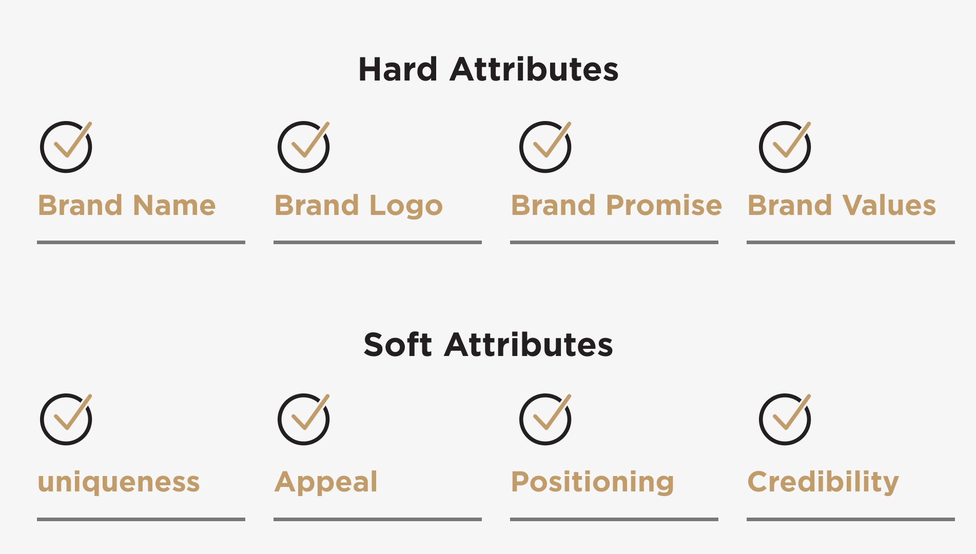
Inform the Process with a Foundation of Strategic Brand Understanding
Before any redesign or rebranding work begins, it’s important to lay the groundwork by identifying the various elements of brand personality and attributes that will inform the look and feel of your packaging redesign process. Defining these distinctive brand characteristics—both ‘hard and soft,’ unpacking them and clarifying how they are distinct and different from the competition will establish a solid foundation for the brand design update process. Think of brand attributes as emotional and functional associations your brand signals to your current customers and ideally, your overall target customer demographic. These attributes are the fundamental building blocks of your brand identity. We’ve put them in two groupings, “hard” and “soft”. Both sets are essential contributors to building and refreshing a strong brand identity and accompanying package design system.
Redesigning Product Packaging For Anchorage Distillery
When Anchorage Distillery reached out to Affinity Creative Group to execute a complete revitalization of their brand packaging system, they knew they needed serious help. With a name like Anchorage Distillery, we immediately recognized that this Alaskan producer of craft spirits had a tremendous brand asset, which happened to be their name. Unfortunately, that was all they had. Their packaging at the time was mainstream, lacking distinction, and looked nothing like the artisan image they hoped to portray. Our mission was to unleash that brand name asset and tell their story through packaging design, imagery, and materials that would stand out on the shelf and online, on both the Anchorage website and in social media channels, conveying the real spirit of the Anchorage Distillery brand.
Honoring Heritage With A New Look
We began the redesign process by gaining an understanding of Anchorage Distillery’s core brand essence—identifying the brand’s hard and soft attributes. We began with the most essential questions: What makes these spirits unique? What makes Alaska unique? How are these two points of differentiation connected? And what about that connection or intersection provides meaning and interest to the target customer? Ultimately, the answers required translation to the visual medium–the glass bottle, the label, and all packaging design elements. Affinity arrived at a final design solution with the perfect look and feel that communicates the desired brand attributes—artisan craftsmanship, distinctly different, and sourced from the rugged natural environment of Alaska. The total package honors its Alaskan heritage as well the unique aspects of the spirits themselves.
Stand Out By Leveraging Brand Personality and Tone In Packaging Design
Brand personality might be described as the sum of attributes associated with your brand name. Ideally, your customer relates to and identifies with these characteristics. Brand tone guides your brand communication style with your customers and influences how they perceive your messaging.
For Anchorage Distillery, we knew from multiple brand planning sessions that they wanted to communicate the brand attributes and associated personality of authenticity and natural ruggedness. Those dimensions of the brand are now embedded in a custom logo design that projects an air of authenticity and achieves strong brand registration on a crisp, white, textured label stock. The additional unique engraving of an Alaskan Moose emphasizes a rugged and robust spirit. From the finely detailed ‘tax-stamp’ look of the bottle’s neckbands to the rippled, die-cut labels, suggestive of the Alaskan water’s edge, every detail imaginable was addressed while always adhering to the desired attributes and personality uncovered during the foundational brand development work.
Functionality Is Key For New Packaging Design
The essence of a good brand strategy and ensuing package design solution is as much as knowing what not to do, as it is what must be done. There is power in simplicity, and devising strategic design for a new logo or new packaging is no different: Using restraint in design, layout, and use of typography helps avoid needless complexity and confusion for the customer. Just as at times a whisper can be more effective than shouting, a clean, restrained design can be more effective at communicating your brand story and attributes to your target audience. To keep Anchorage Distillery both clean and straightforward, we streamlined the selection of bottle structures, while still imbuing personality and the feeling of the Northern Lights through the use of arctic blue translucent colored glass for the Aurora Gin offering.
Getting Started On Rebranding Product Packaging
Refreshing tired or dated packaging can be an overwhelming and taxing experience. But, by following the tips above and having a strong agency team by your side, a brand design update can be done with efficacy and efficiency. Remember, the most important points to consider when initiating a makeover of your brand’s packaging are your core brand attributes, personality, and tone of voice. Use your understanding of your existing brand equity to evolve to meet changing tastes and the trends of the times. The rebranding process involves strategic understanding, creative know-how, and a sound process. When successfully executed, you’ll reap the rewards of a stronger brand presence, greater brand recognition, and increased market share.
Do You Need Help Developing New Packaging Design?
The expert team of talented designers and consultants at Affinity Creative develop on-target brand identity strategies, build competitive brand portfolio architectures, and craft custom package design systems that make our clients stand out. If you need help updating your brand identity or the look and feel of your product packaging, learn how we can help add value to your efforts by getting in touch today!
About The Author: Cynthia Sterling led Sterling Creativeworks for 23 years before merging her talents with Affinity Creative Group. As Creative Director, Cynthia spearheads an exceptional team of industry-leading branding and packaging experts in building stand-out brands for leading wine, spirits, and food producers.
