A Real Page Turner
Textbook Wines
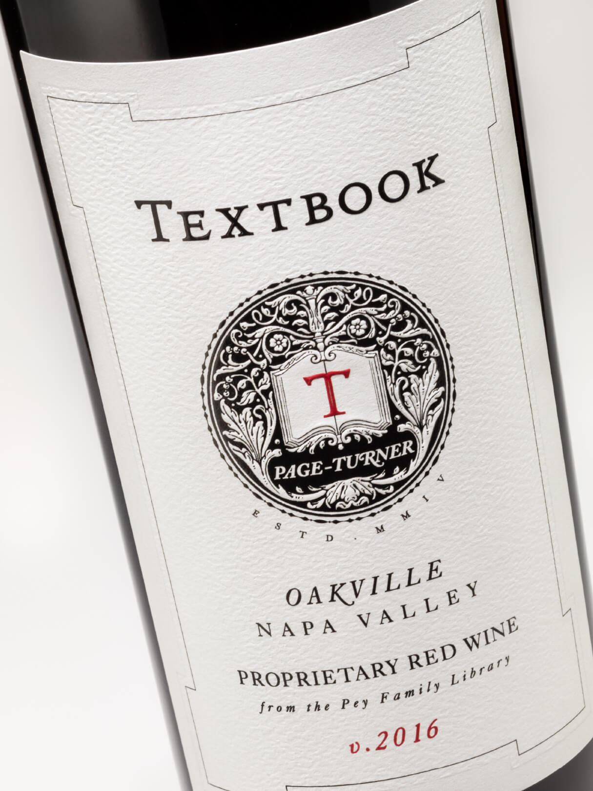
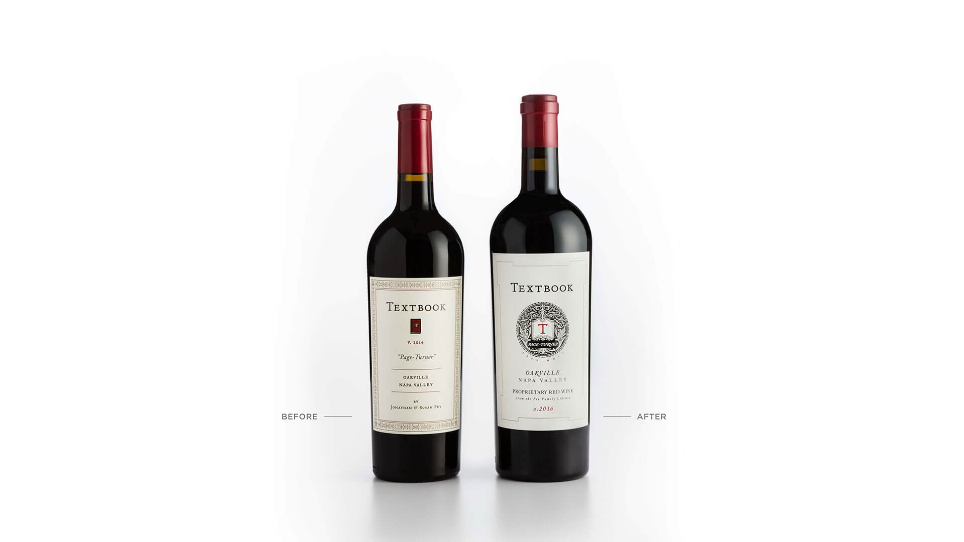
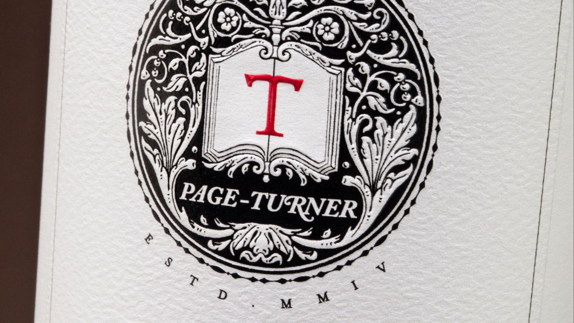
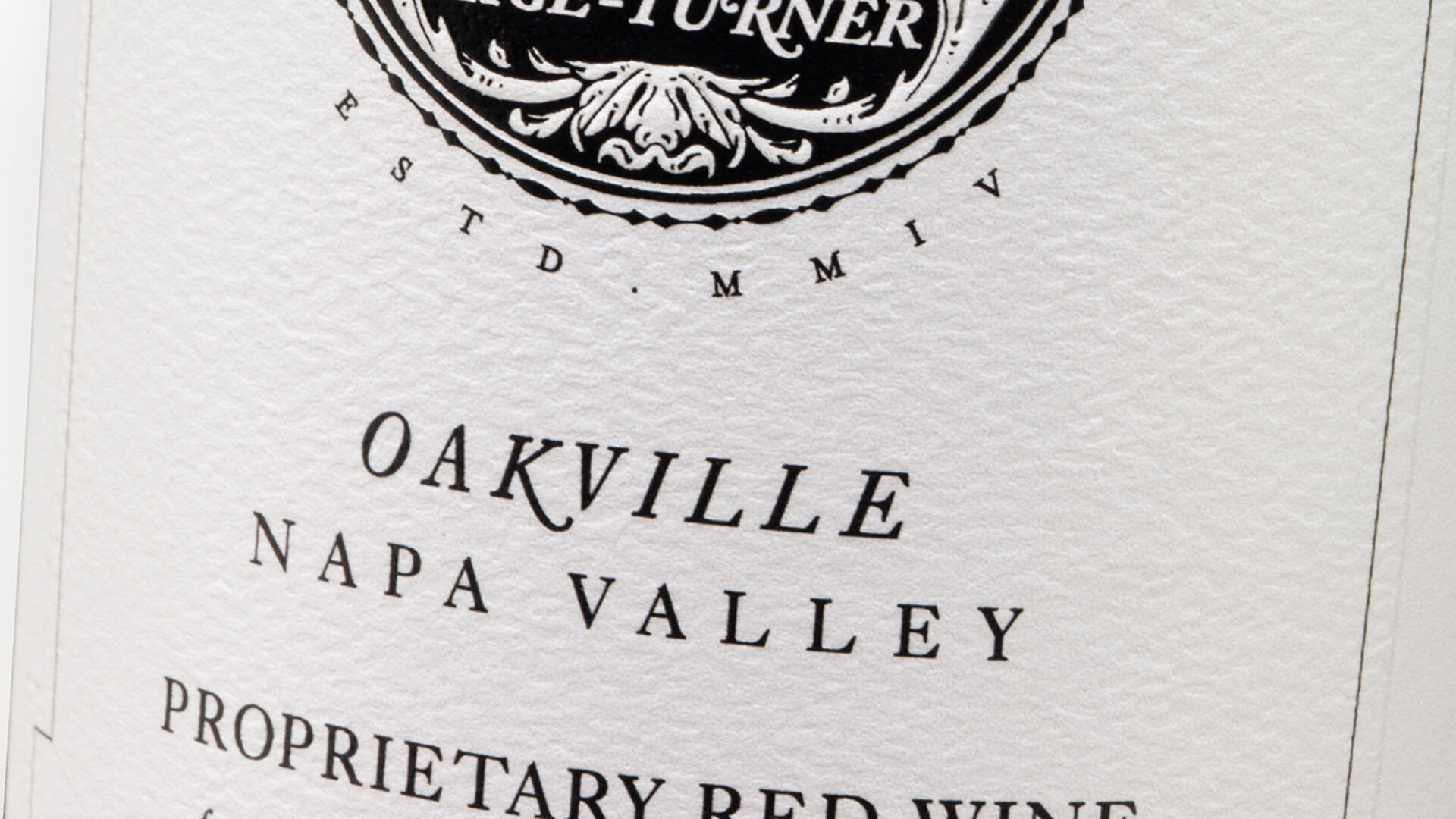
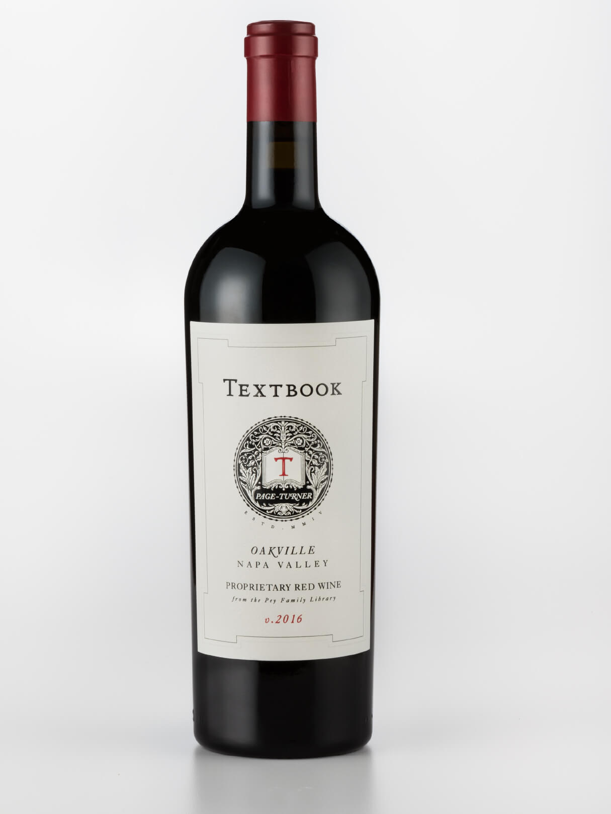
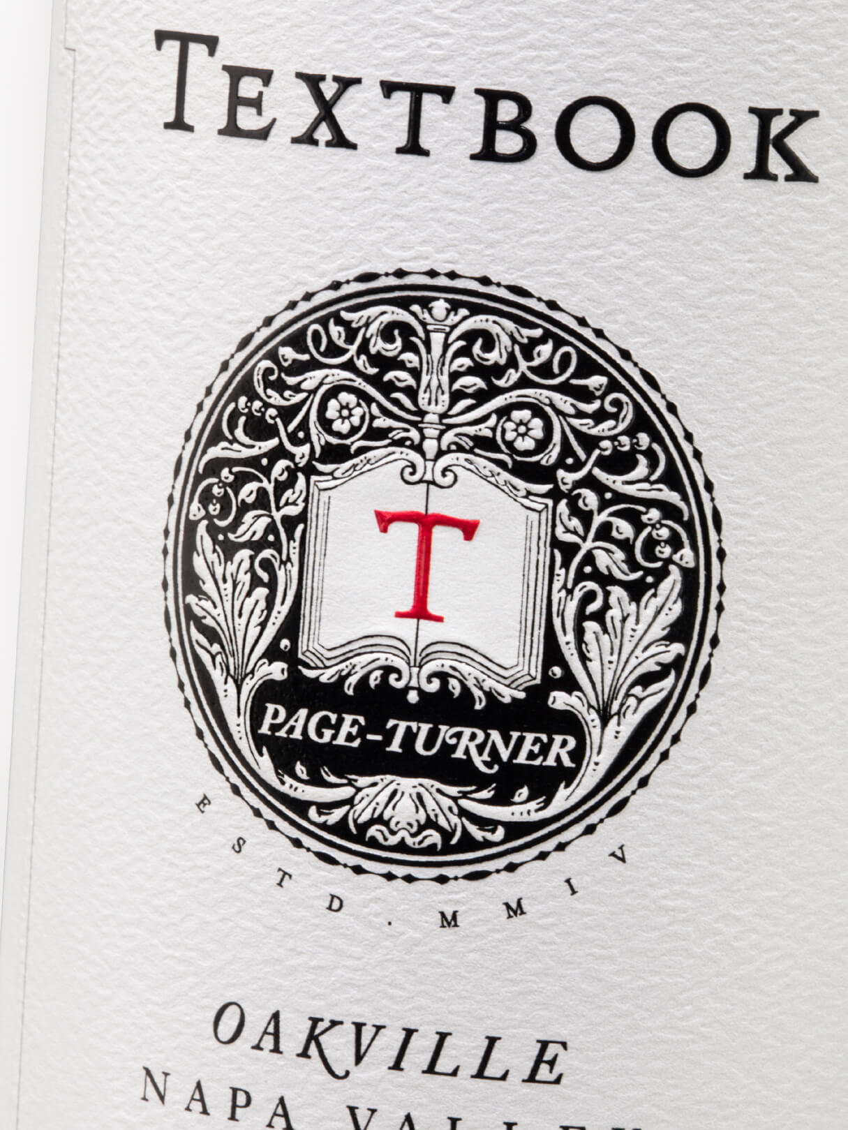
Affinity was tasked to differentiate and elevate the Oakville AVA while using the core TEXTBOOK brand. We retained visual references to the established brand equity, while adding interest through the use of an intricate and highly detailed rosette device that serves to draw attention and heighten intrigue around these two special offerings.
The Objective
DIFFERENTIATE & ELEVATE
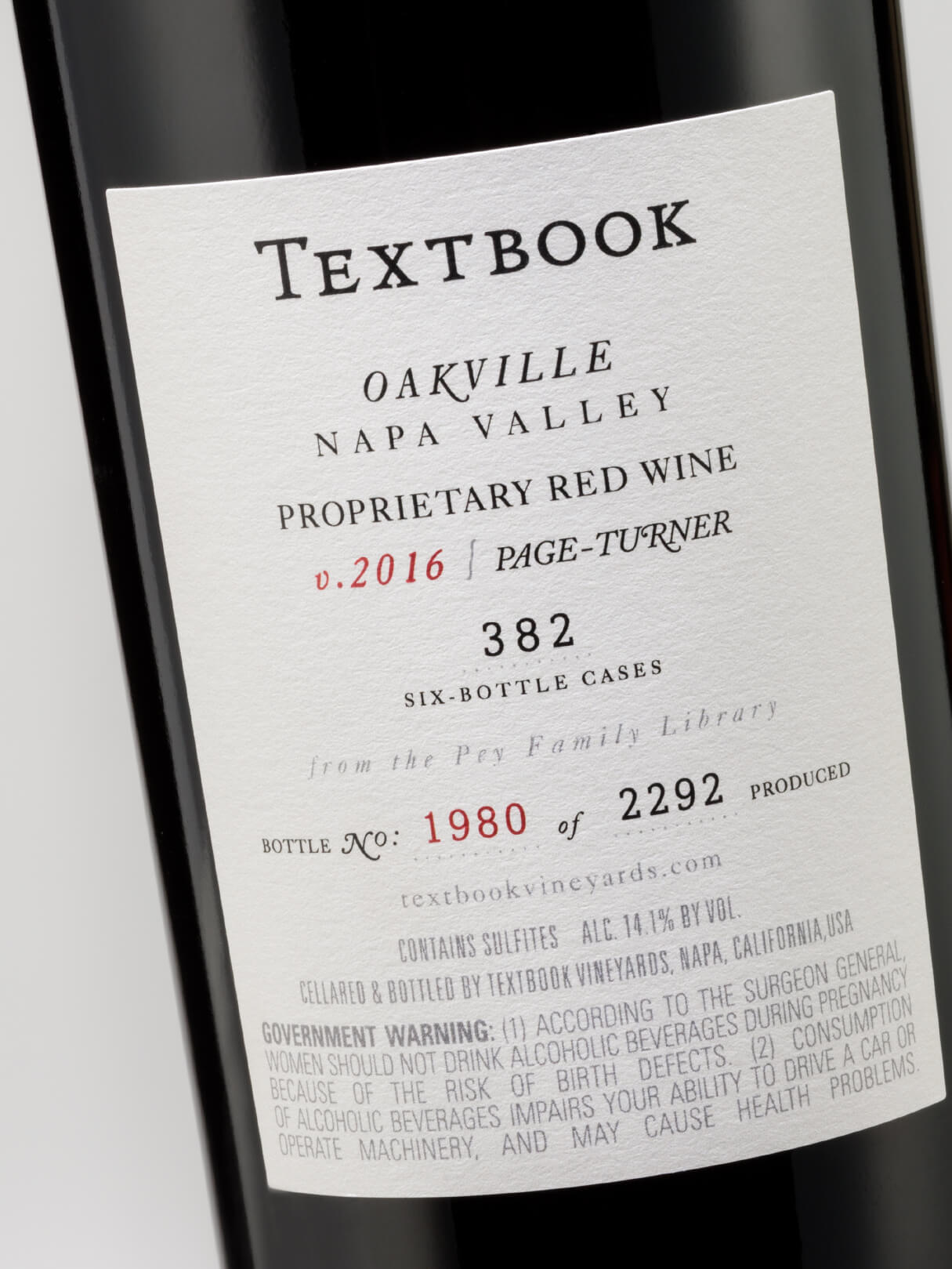
The look and feel of a classic library volume is delivered by melding authentic and regal typography elements, unique border treatments and the addition of a red ‘T” monogram, which creates an unavoidable focal point. The use of a large label size, application of a on-trend, shorter capsule, and choice of a more substantial, higher-weight bottle, completes the distinguished look and feel of these elevated selections within the TEXTBOOK portfolio and supports a much higher price point from the core line.
The Result
A TEXTBOOK YOU'LL WANT TO OPEN
"From the first day meeting with the Affinity team to discuss my TEXTBOOK Oakville wines there was an obvious connection. We spoke the same language, yet we were not tethered by tradition or a need to prove ourselves. My TEXTBOOK mandate to the team was pure; differentiate the Napa Valley tier from the Oakville tier, and elevate the Oakville tier to be commensurate with its Oakville neighbors. We explored a wide variety of design directions, settling in on a few that kept the brand heritage vivid and clean, but gave it richness, authenticity and a textbook sense of style".
— Jonathan Pey, Proprietor, Scenic Root Winegrowers