Revamping a Ramen Enterprise
JINYA Ramen
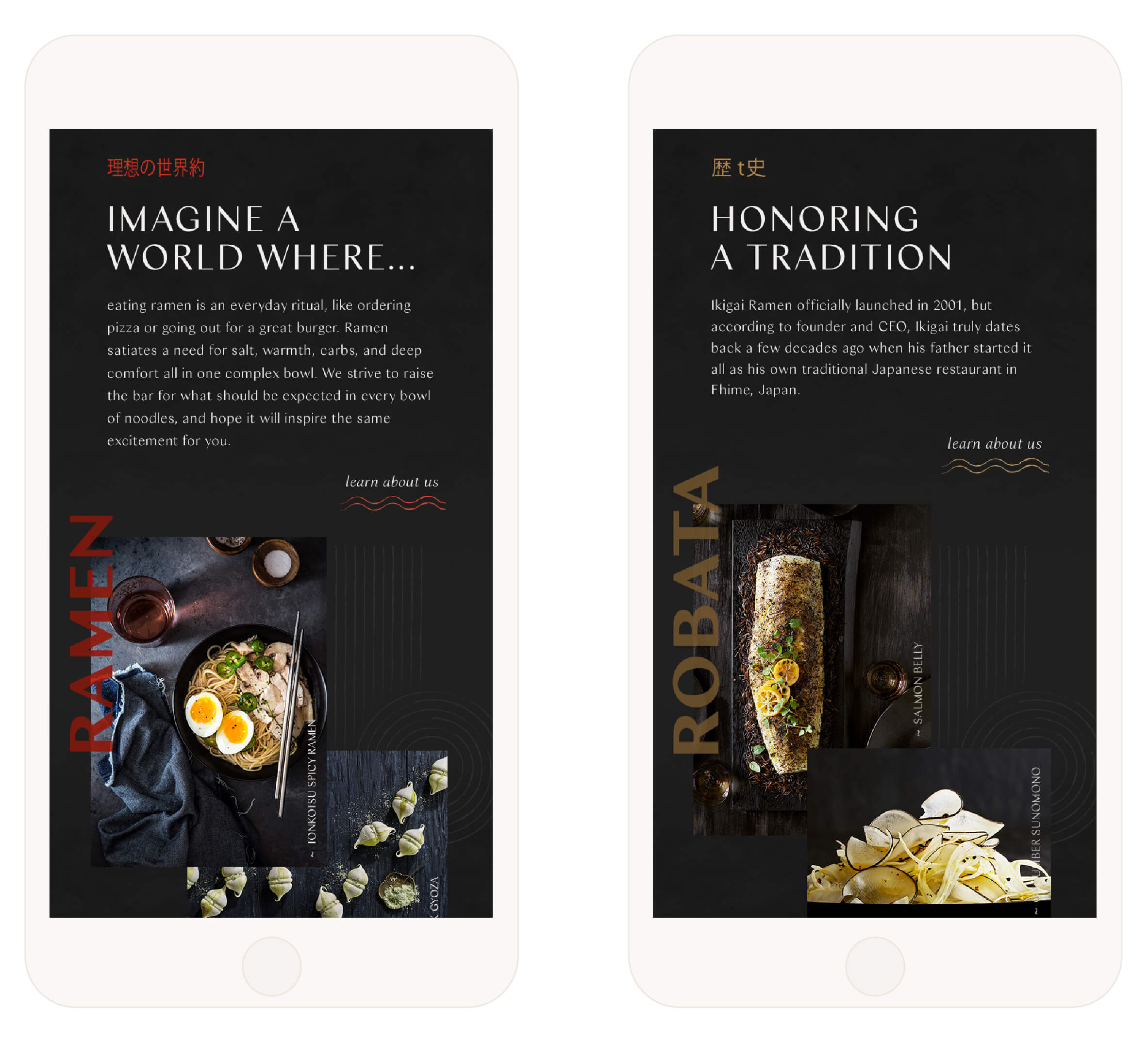
Imagine a world where eating ramen is an everyday ritual, like ordering pizza or going out for a burger. This was the vision for JINYA Ramen Co and its franchise. We were tasked with creating a modular website flexible enough for each of JINYA’s five individual brands to use. The result was a cohesive, connected digital experience, enabling each to keep their own identity while sharing a consistent framework.
Website Strategy
A MODULAR DESIGN APPROACH
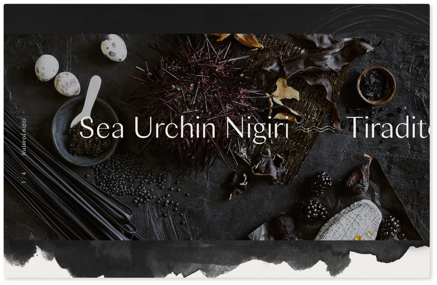
We centered JINYA’s sites around savory food photography aligned with each brand’s dining experience. Robata’s dark interface highlights luxurious Japanese cuisine while JINYA Ramen Bar’s complementary palette embraces the warm comfort found in a bowl of ramen. The UI was kept clean and purposeful while subtle design details were incorporated to add depth, texture and intrigue.
Responsive Web Design
MOBILE-MINDED
Responding to an increasing trend in mobile ordering and food delivery apps, a seamless mobile experience was essential. Due to each restaurant’s delivery and reservation system varying between franchise locations, we focused on an overarching site design for each brand. A Location page detailed restaurant locations nationwide where delivery and online ordering information could be organized and easily updated.


Landing Page Video
ROMANTICIZING RAMEN
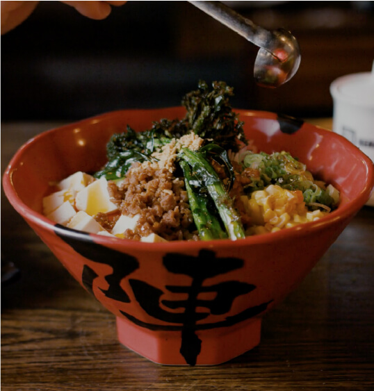
The process of making just one bowl of ramen is a highly intricate one and what better way to highlight it than through video. We produced a sensory video romanticizing the ramen-making process that would be featured on the landing page of JINYA Ramen Bar’s site.


Deliberate Details
We aimed to highlight the many small, yet deliberate details that go into JINYA’s process for making just one bowl of ramen.


