Extending Brand Equity
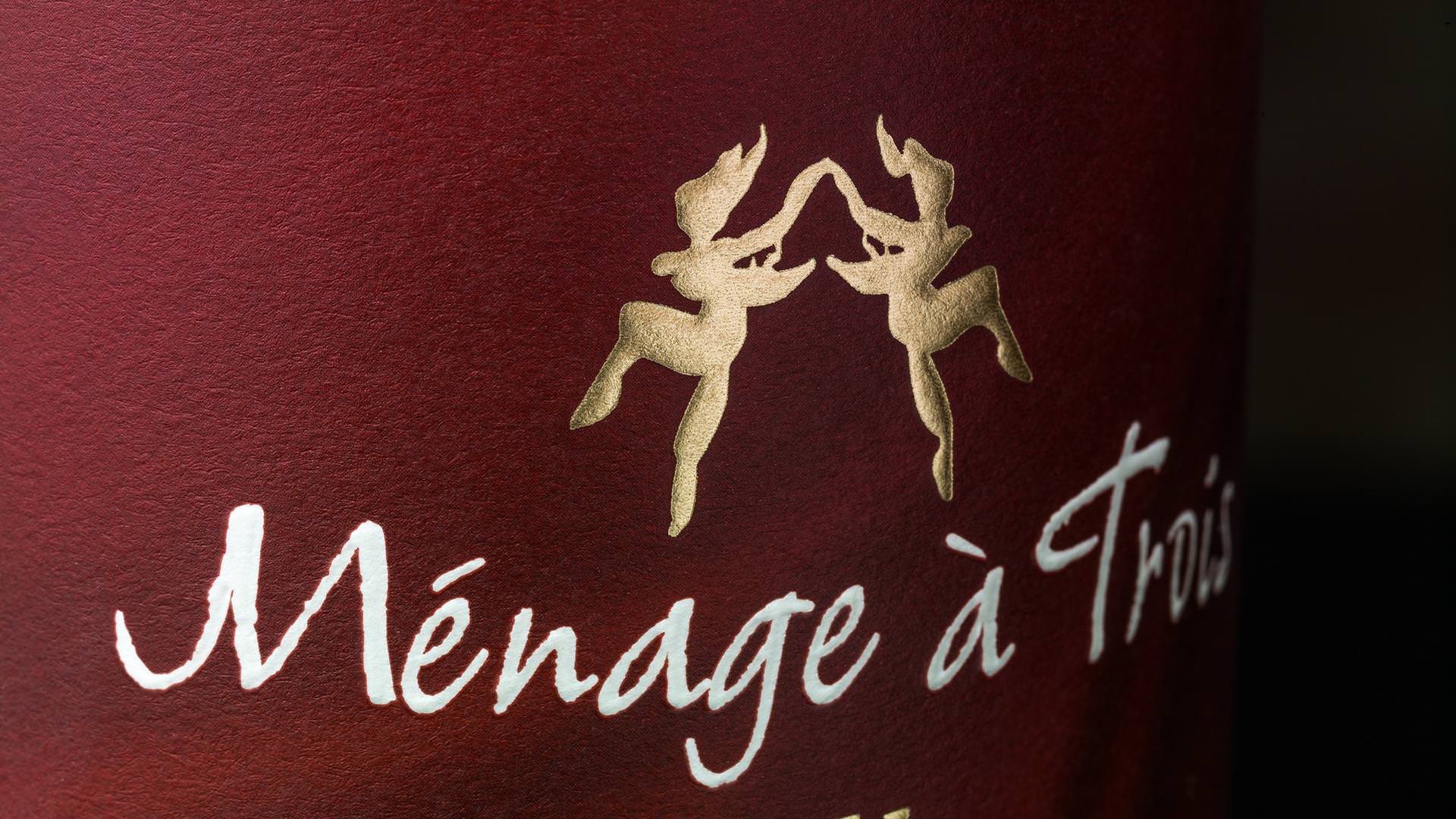
MÉNAGE À TROIS
Our client, Trinchero Family Estates, wanted to capitalize on the growing trend of producers offering diversity and intrigue in the premium red blend wine segment. Our assignment: re-invigorate an established wine category through strategic line extensions, compelling packaging, and a refreshed core-brand presentation.
Step One
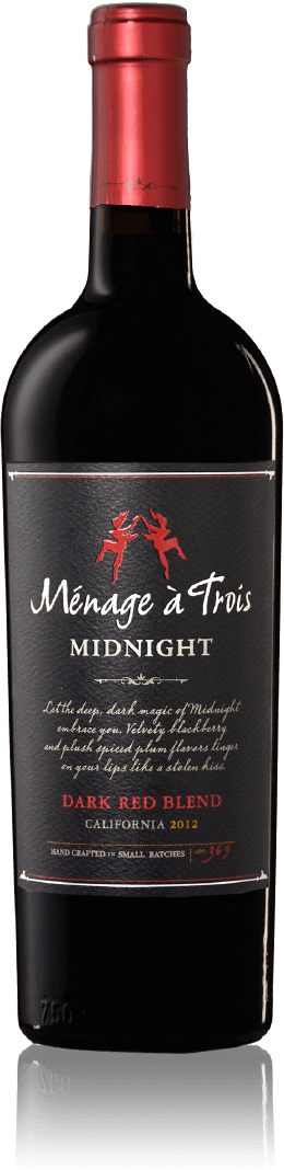
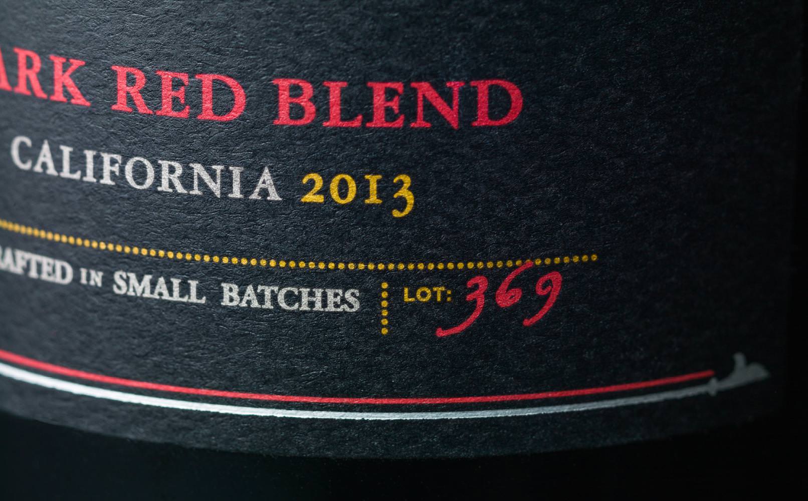
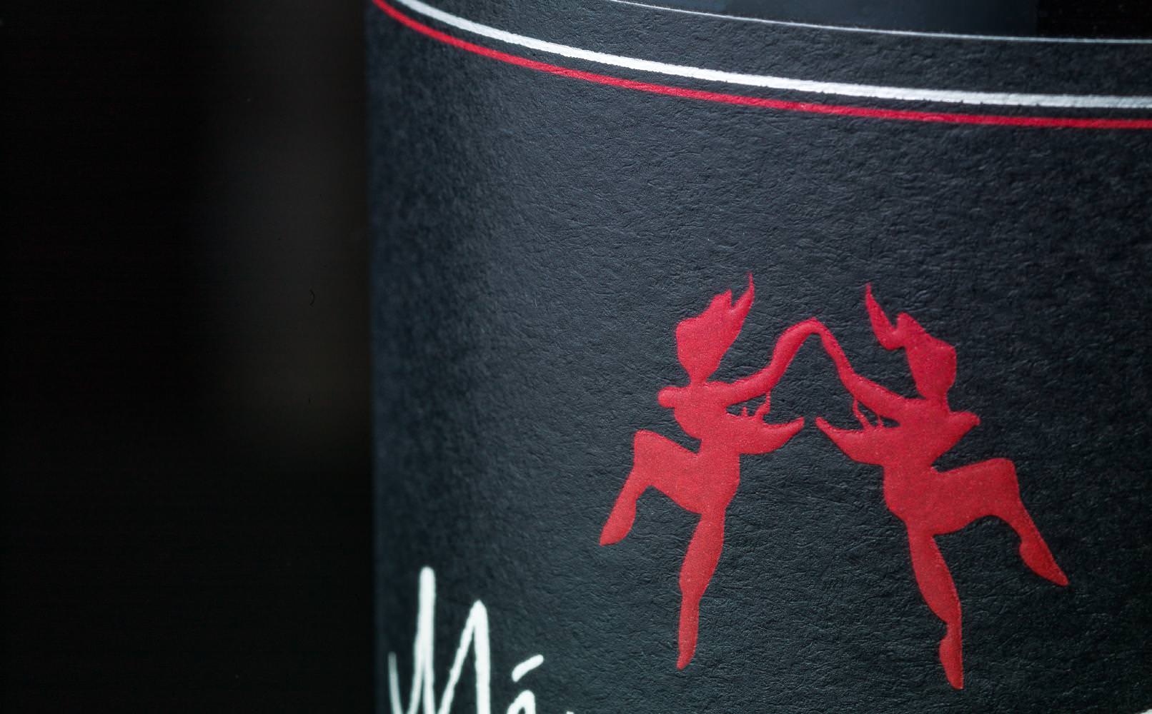
MÉNAGE À TROIS MIDNIGHT
It’s deceptively simple–create a line extension for Ménage à Trois that embraced the brand’s fun, playful and flirty essence, yet inserted a bit of mystery and edge to the brand presentation. The result is our design and sub-brand presentation for Ménage à Trois Midnight. This dramatic black label with touches of red and silver embellishments leverage all of the Ménage à Trois core equities, while making a distinctive and unique statement that screams "I’m different—you should pick me up and take me home."
Step Two
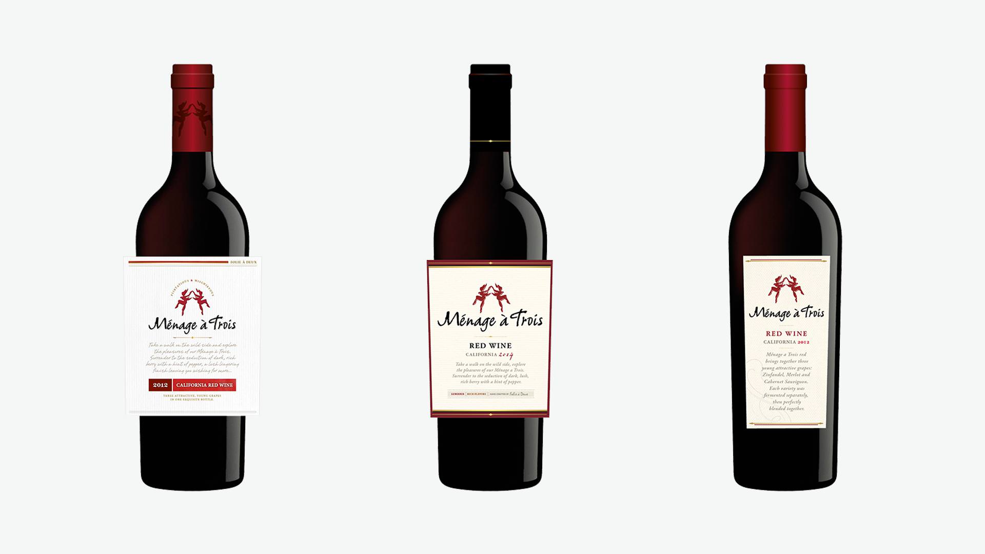
MÉNAGE À TROIS CORE
The runaway success of Ménage à Trois Midnight–500,000 cases in year one–led to an extensive study for the brand and packaging renewal of the core Ménage à Trois "Red" wine. Which, when you think about it, is The Original mass-premium red blend wine.
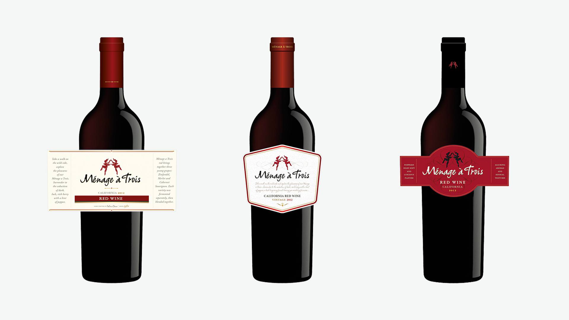
Step Three
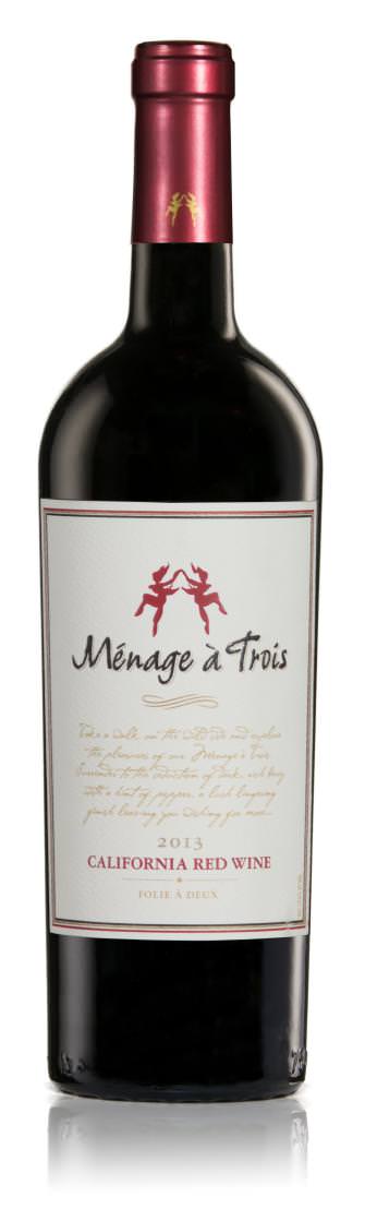
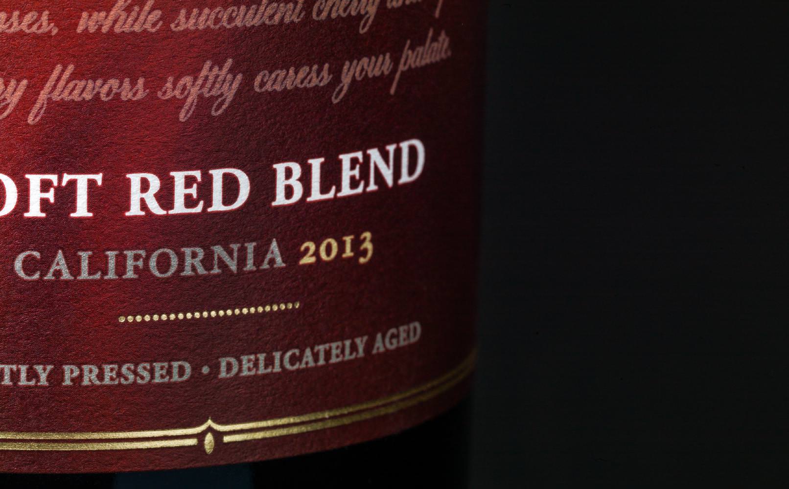
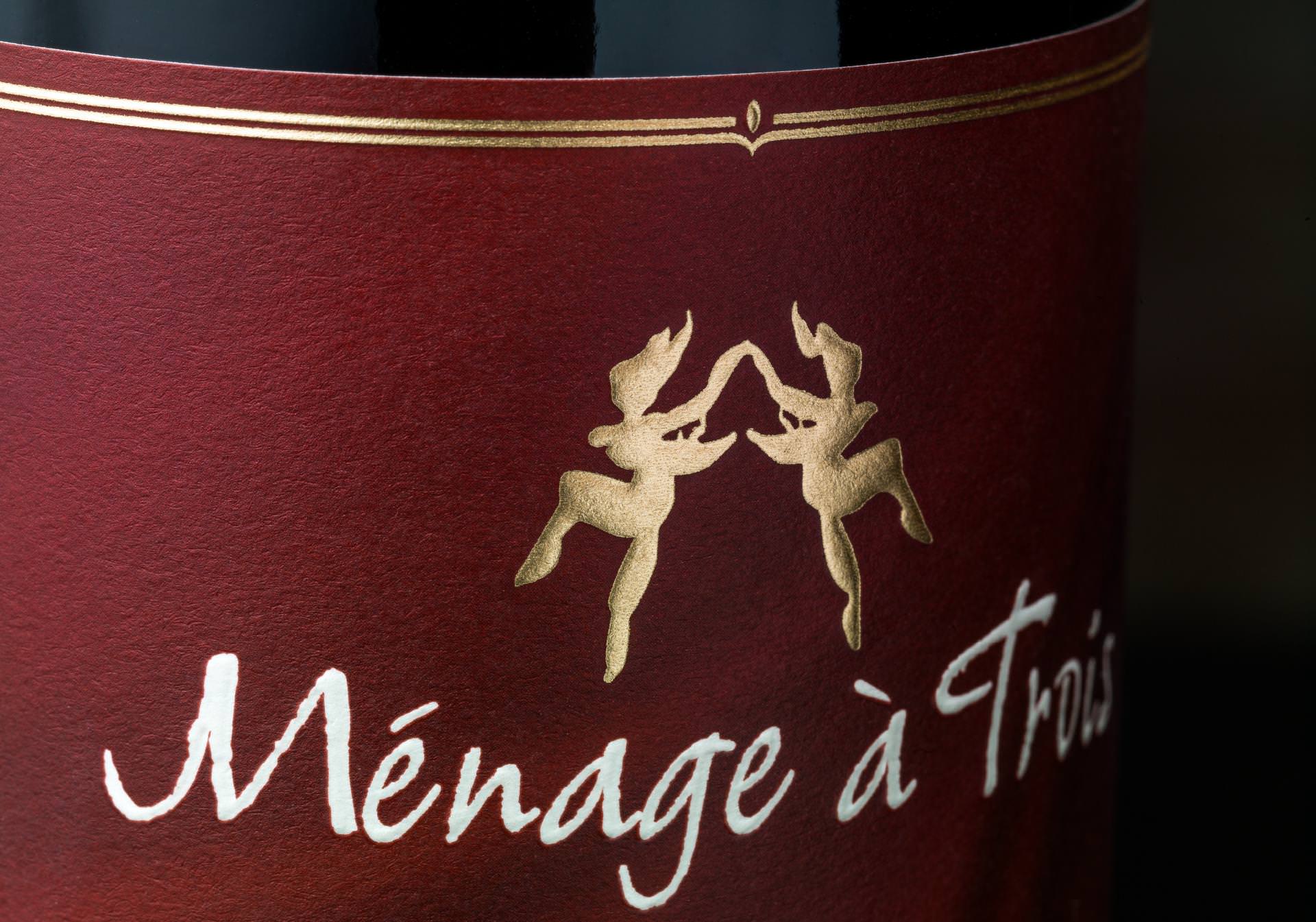
MÉNAGE À TROIS RED
In this case, the core or established SKU was strongly influenced by the line extension. Ménage à Trois now employs the full label panel, using high quality uncoated stock applied to glass with a more substantive shoulder and profile.
Step Four
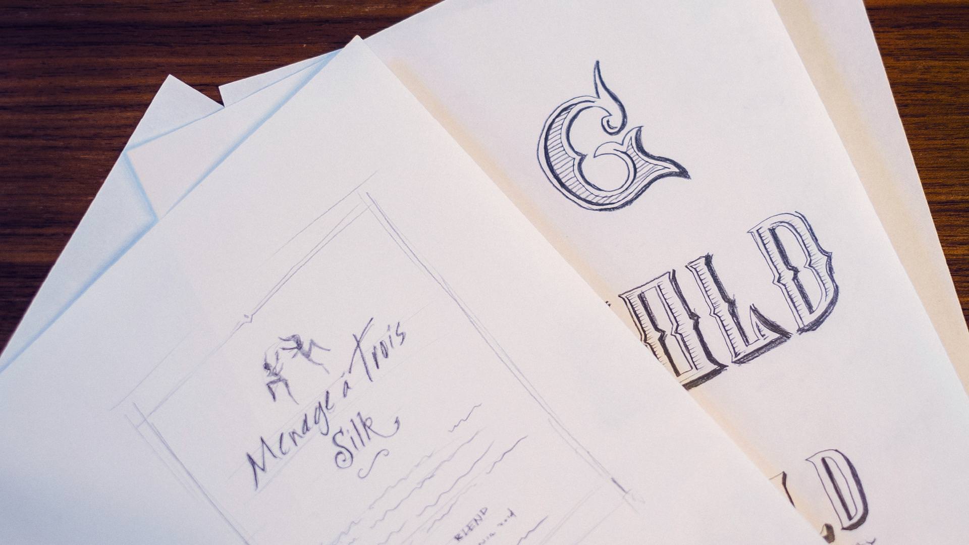
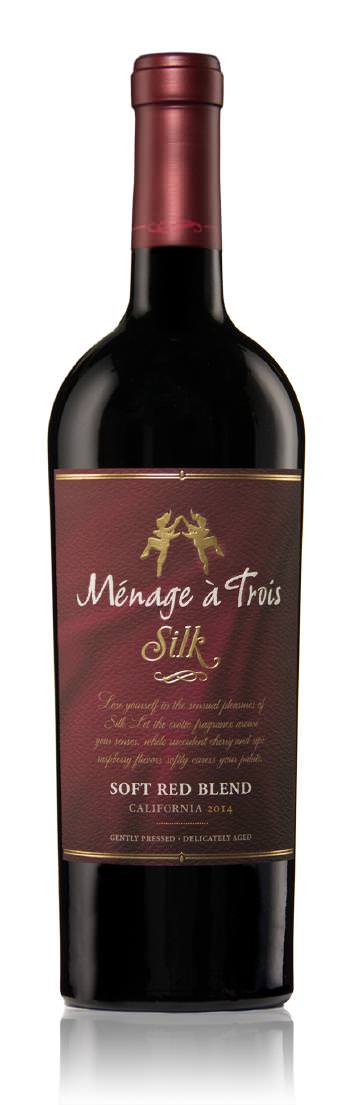
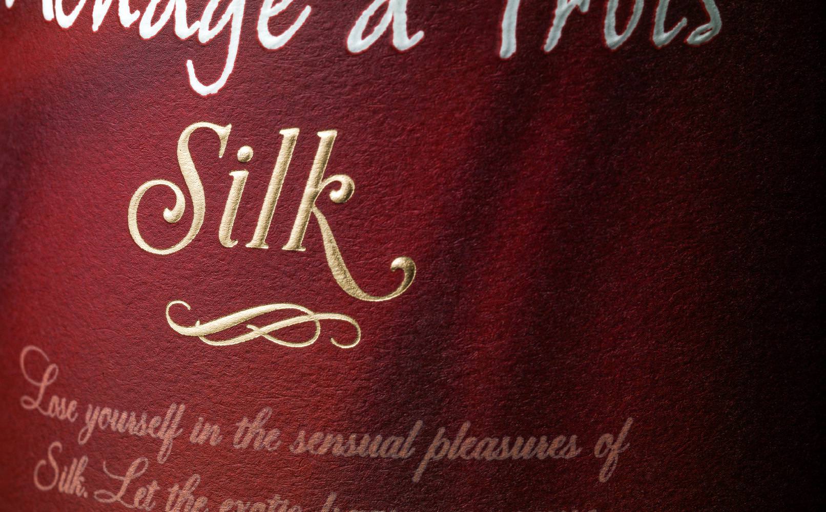
MÉNAGE À TROIS SILK
Trinchero Family Estates next entrusted us with the development of a companion line extension. One that would "sit" on the other side of the core red blend wine. This new offering, a softer and more luxurious red blend, received the distinctive sub-brand, "Silk." Affinity leveraged the newly established look and feel established for Midnight and the core Red wine, modulating it with new background patterns, colors and use of typography, to convey the gentle and languid nature of the wine.
Step Five
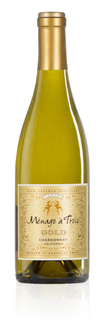
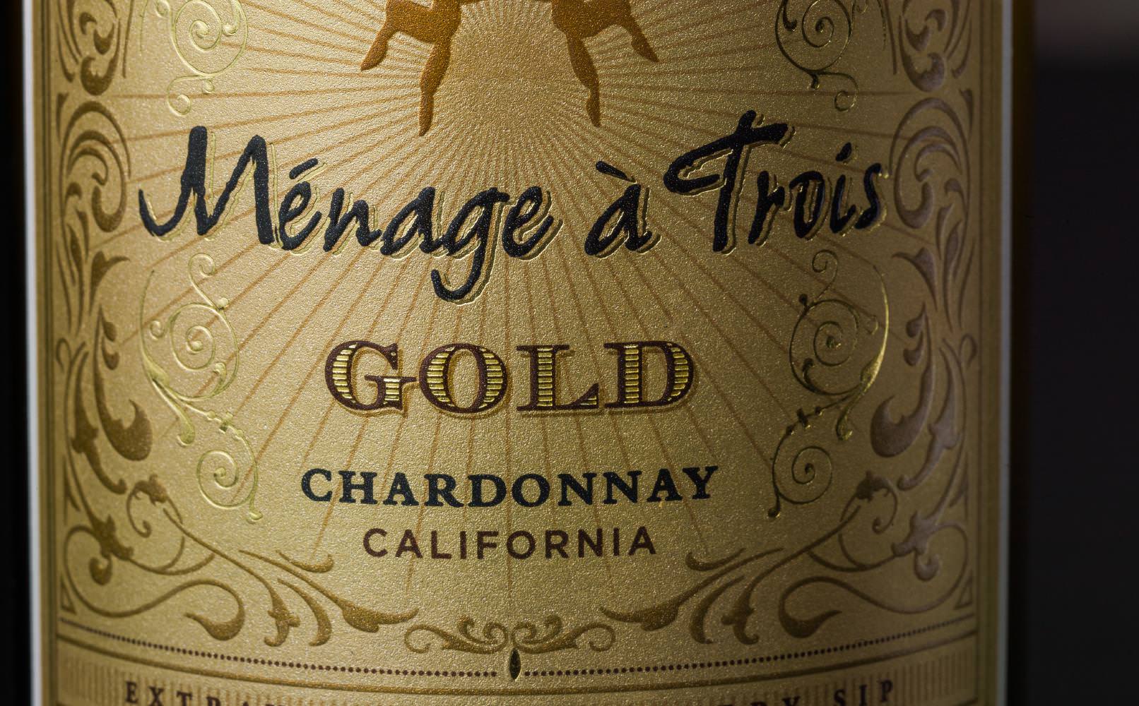
MÉNAGE À TROIS GOLD
Based on the success of Midnight and Silk, Trinchero marketing leadership decided to use a fanciful descriptor on their Chardonnay varietal. The resulting design for Ménage à Trois Gold is brash, bold, and dazzling–a multi-layered and dimensional label that is literally covered in “gold” and signals a deep, rich flavor profile. The gleaming new label brought significant attention to a SKU that previously had little awareness, and now enjoys a significant lift in sales.